|
Every Casual Notice comic starts as a script. That's not entirely true. The comics start as part of an annual plan of developing story arcs. I type this plan up and keep it with me in a locked briefcase, even to the point of making airline personnel uncomfortable. Anyway, it starts with the plan of major arcs. Then, for each strip, I develop a script. Sometimes, I keep the script in my head and continuously edit it while I draw. Sometimes (some of the comics during the Astra cross-over, for example) I type up a formal script and stick to it more or less to the letter. Either way, I have to have a script so I can draw the panels.
|
|
|
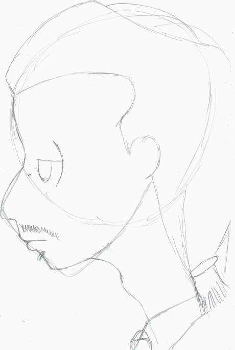
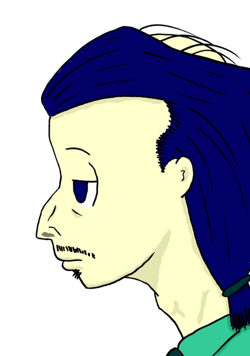
The art work is the most complicated part, and (for me, anyway) the hardest. Once I've settled on a script, I begin pencilling each panel. Comic panels are like scenes in a movie, but don't have the benefit of motion, so a single frame must convey all of the action of an event or conversation. The panel at right is supposed to convey thoughtful contemplation. I use a Pentel 0.5mm drafting pencil on Mead Academie sketch or drawing paper. I could probably affor to use artists' pencils on Bristol, but then, I could also probably afford to buy brand name rum instead of the well swill I do drink. I don't free-hand particularly well, so I start each drawing by roughing out basic shapes. For a profile, like this one, as you can see, I begin with a circle for the main part of the skull, and a rough muzzle for the lower part of the face. The muzzle is very important, because each of the main characters can be more or less easily identified by the basic shap of their jawline. I then pencil in various broad aspects of the panel. In a full scene (that is, one that is not a facial close-up), I usually do a full background. I have one or two "sets" that I can paste bodies into, but, since I really suck at resizing objects to fit these, I tend to just go ahead and draw individual backgrounds for each panel. |
|
|
|
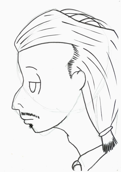
The next step is rough inking. I follow the best pencil lines, usually using a Faber-Castell Pitt artist pen with a brush tip. I add some larger details that depend on the pencil lines for accuracy (the lines defining Steve's sideburns, for instance). Once that's done, I get an eraser and do the primary clean-up on the picture, erasing all my original pencil lines. |
|
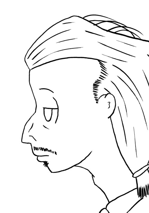
With the pencils gone, a draw in more details. For this, I use a variety of pens: The brush pen, Staetdler Pigment Liner pens in a variety of widths from 0.1 mm to 0.7mm, a Papermate Flair pen (which affords line width control but without the range of the brush pen), and occasionally, even a Sanford Sharpie. When this is done, I have another go at it with the eraser to clean up any pencil marks I missed the first time, then I scan it in on the Black and White (1-bit) setting at 300dpi. The scanned picture then undergoes even more cleanup on the computer to remove any scanning artifacts (and, yes, still more stray marks that I missed) and correct any inking mistakes I may have made. To do this, I first create a mask that excludes the line-art, then I use the eraser tool to wipe the entire page (except for the excluded line-art) clean. I could probably just copy the line-art as an object (I use Corel Photopaint, which creates objects instead of layers--I'm pretty sure the only real difference is terminology), but I don't, for some reason. I then scale my eraser down and clean up the line work. The last thing I do is convert the picture to 24-bit color, and get ready for the coloring process. |
|
|
|
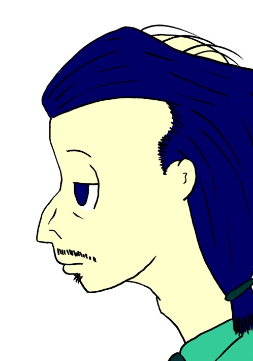
Color is done in layers (object). each different color I use is its own object, and then they are combined with the background using the "if darker" filter. Again, if the line work was also an object, I suppose I could just make it the top object, but I don't. |
|
Shading is also done with objects. I'm still working on my technique in shading, so this is likely to change, but what I do right now, is I use a single object with shaded areas created in various depths of grey. I then combine it with the background using the "subtract" filter. When I first started trying to shade the comic, I was doing on the background page using a darker version of the original color, and it wasn't working for me. I still have a ways to go yet, but I think I'm on the right path. Occasionally, I draw in highlights. These are done the same as shading (on a separate object) except that I use the "add" filter. |
|
|
|
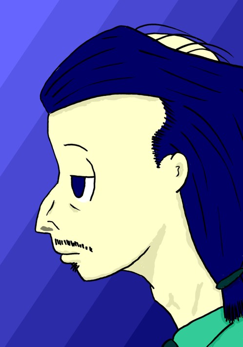
If I don't have a line-art background, I generally fill the background with a fountain flood. I tend to lean toward blues and greens for this. Once finished, each panel is saved at 300 dpi as a Corel PhotoPaint file. I complete the above process for each panel. I very rarely use cut-and-pasted panels. |
|
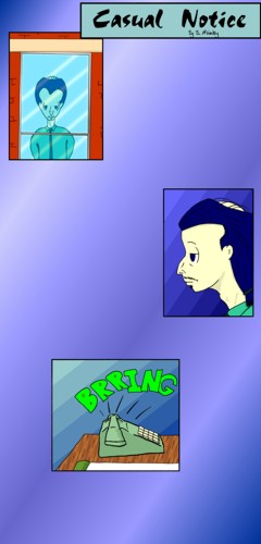
Now comes paste-up. I resample each panel twice. First to reduce the resolution to 72 dpi, which is something like a standard (it's not a standard, it's just like one), then to reduce the panel to a usable size. Lately, I've been reducing the largest dimension to 350 pixels, which seems to work well. The picture is copied into a 720 by 1500 pixel template with the CN fountain-fill pattern. I create a border mask to draw a border around the panel. Once all panels are in place, I copy in the Casual Notice title banner, and shift the panels around to find a good layout. When I'm happy with that, I combine the panels (and the title) with the background. |
|
|
|
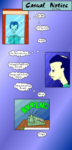
Finally the words. First I type the dialogue, without ballons, into the layout. Sometimes I have to edit the script on the fly for space. Sometimes I don't and I really should have. Usually, when characters are speaking, I use the circle tool to draw balloons around each bit of dialogue. I then join and point them using a polygon tool. The last stage is to move the balloon and polygons to the back and white-out the joints. the comic at left is unique in that it's composed entirely of thought balloons, which I drew by wand on a single object, then filled. The connecting bubbles are all done with the circle tool. Again, the last step was to move the object behind the text and clean it up. Once that's done, I proof-read the text for spelling errors. Then, if she's available, I have my wife proof it as well. I make necessary corrections, then merge the text and balloons into the picture. I crop the template down to the minimum necessary to contain the comic, then save it as a JPeg file. |
|
The JPeg is loaded into a template with navigation buttons. Links are made. Then the whole schmeer is uploaded to the Casual Notice website. The image above links to the full-size version of the final comic in its template. And that, my fuzzy little muffins, is how it all happens. I guess it seems like a lot of work for a dopey little three-panel (let's call it) weekly. It probably is. Enh...I enjoy it. |
|